- Take a magazine, newspaper or book that includes images and text. Lay tracing paper over the top of three spreads (both left-hand and right-hand pages). Using a pencil and ruler, carefully trace the grid underlying the page layouts. Remember to remove specific text elements or images, and to only draw the grid lines. Note column widths and margin sizes at the top, bottom, and to the left and right of the main body of text. Is your document based on a two-column, three-column, or another type of grid? Which elements stay the same on each page, and which change?
- Publish your findings to your WordPress blog and provide photos or scans of your exercise.
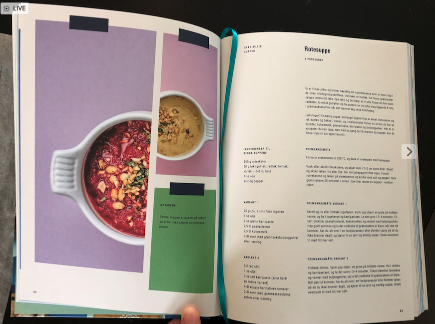
For this LT I chose the Norwegian cooking book “Sykt Billig”.
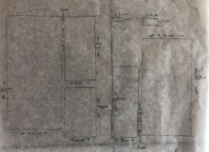
It has a two-column layout on both sides. On the first side, it is just pictured, and on the second only text.
The only thing that has changed from page one is the space between the columns on page two. On page one there is a 6mm space between the columns and on the second page, it is 8 mm. They have also moved the text on page two so it starts further in than on the picture side. I believe they probably did that so they can be sure that the text is readable because it is a very large book with many pages and the pages don’t lay flat.

