LT 3.1 Compare good and poor typography on websites
Developing an eye for good and bad design is key for any designer. This is what sets great designers apart from average ones.
This task will help train your eye to notice the finer details of your designs and where they need improving.
Find two websites: One that shows good typography design and another one that doesn’t. Then explain why the good one is good and the other one is bad.
I absolutely love typography, it can make a lasting impression and bring a design to the next level. Or it could be the make-or-break future of the design.
So let’s start with the bad typography design so we can end on a good note.
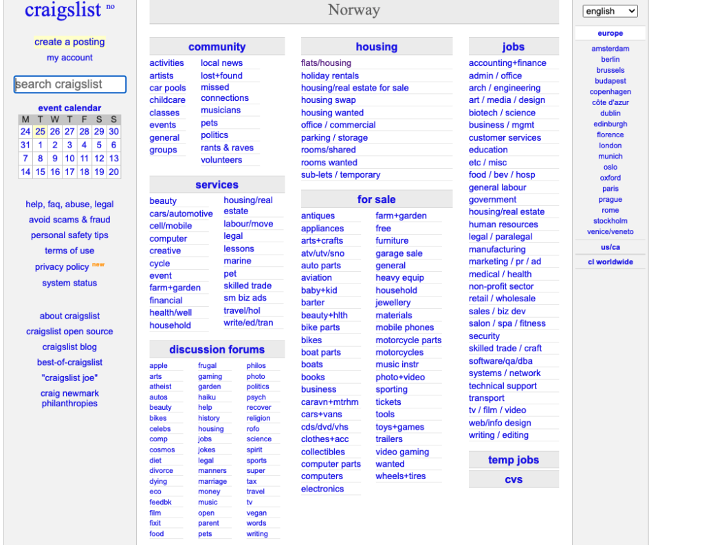
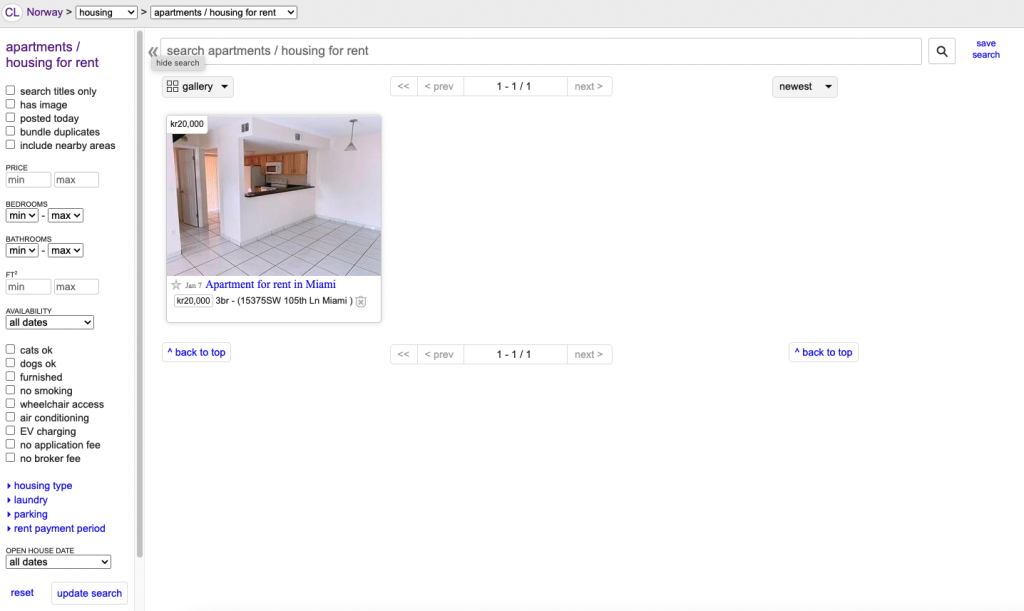
Here is one of the most visited websites in the world and maybe the one with the worst design and typography you could imagine. It is only text and linked-based and, it hasn’t changed much since 1995. Yes, I am talking about the famous craigslist.
The text is super small and if the headlines weren’t centered in the middle and in a sort of greyish box I think they would have just blended in with the rest of the text despite being a little bit bolder. They don’t even bother to use capital letters when starting a word or in their headings. There is no clear hierarchy between headings and body copy. The all-blue makes it hard to focus and hard to read. Everything about this website is a mess and I actually don’t know how it could be so popular. It doesn’t excite me at all!
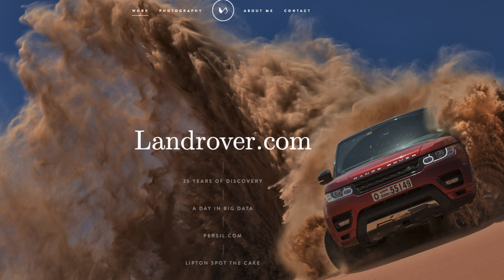
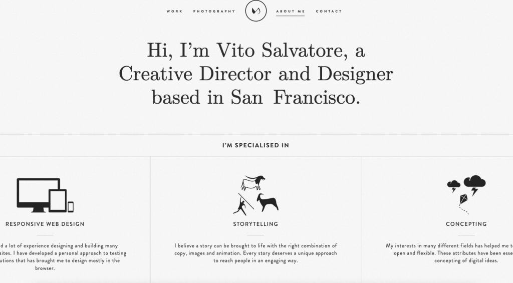
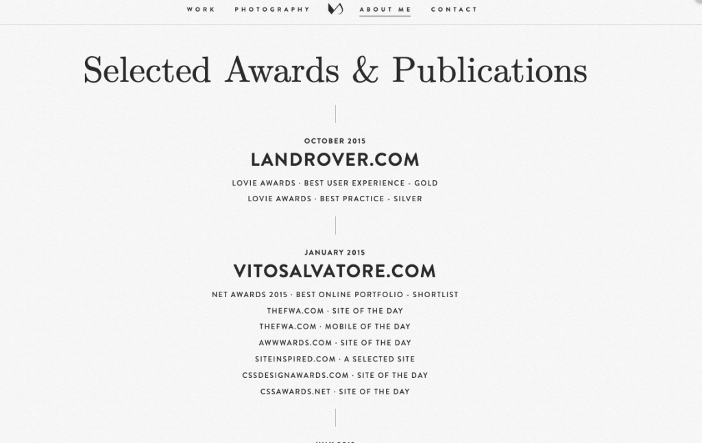
Let’s move on to a website of a Creative Director and designer named Vito Salvatore, whom I found online with great design and typography working together beautifully.
Here he is using both serif and sans serif typefaces that work beautifully together in harmony. He has a clear hierarchy between headings, subheadings, and body copy. A good balance with line length and text alignment. It is very captivating and has a strong and clear message. I absolutely love everything about this design!
