Develop a name for a dog food product. Design a logo for this product, using full color. The logo must contain a main visual and typography. (Use the “People Saving Pets” logo as a guide – this does not mean your design should be the same, it is simply an example.) Follow each of the fundamental steps outlined above, in that sequence and take note of what needs to be handed in as you progress through these steps:
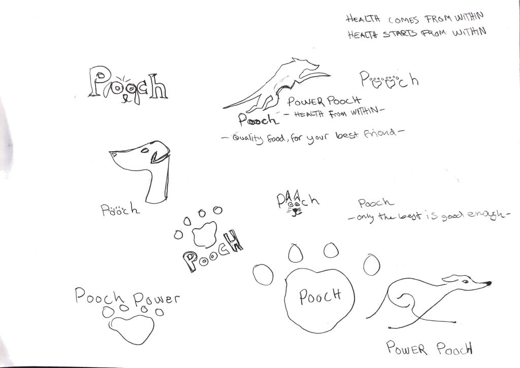
- Exploration – Use sketching techniques to draw thumbnails and hand in your thumbnails as scanned PDFs.
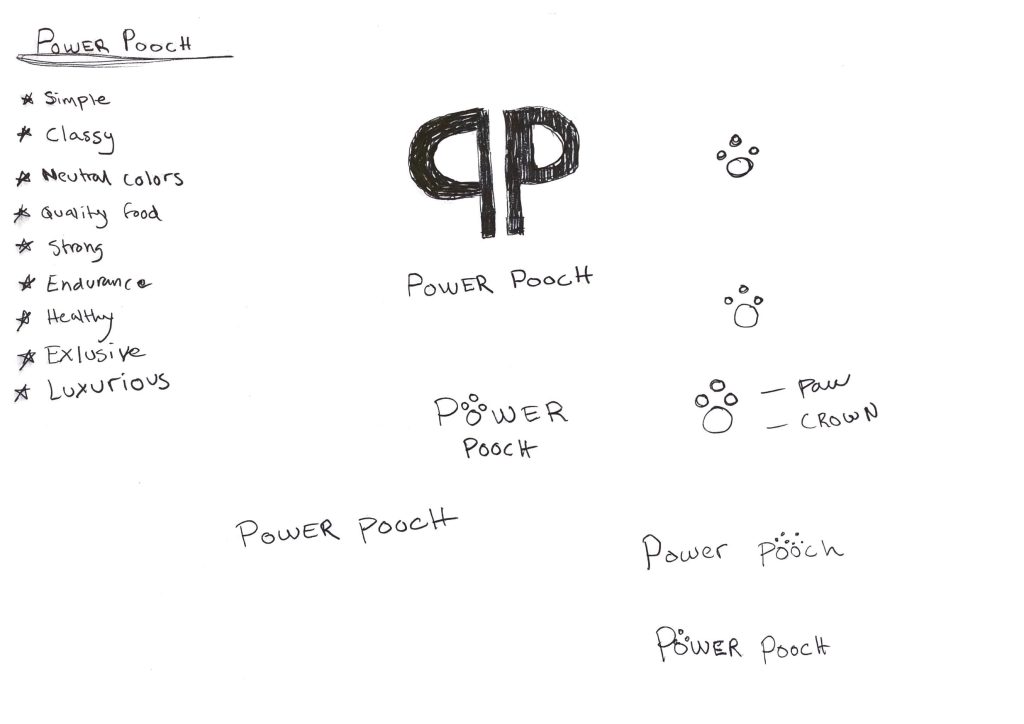
- Focus – Highlight three of the thumbnail ideas that you consider the best options and state why. Hand in an A4 with visuals of the three chosen thumbnails; include reasons for choosing each of these three options.
- Construction – Use sketching techniques and redraw ONE of your chosen concepts until you’ve reached a conclusion on a successful logo. Hand in your drawings as scanned PDFs.
- Testing – Experiment more with your favourite options from Step 3 and ask the opinion of a few people. Hand in examples of the logos shown to people and write their feedback or opinion on each.
- Refinement – Choose your final design and execute it in Adobe Illustrator, along with the name of the product. Hand in your final logo as an A4 PDF.
For this assignment, I started brainstorming for a name that would fit a dog food brand that I had in mind.
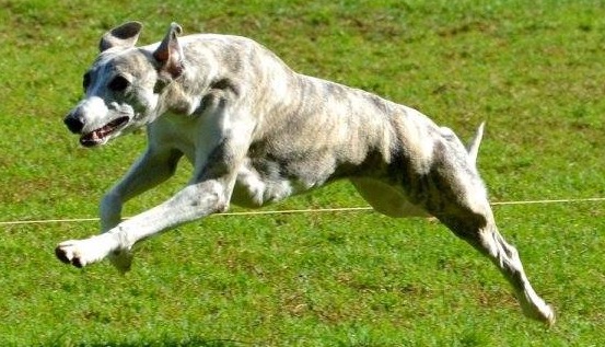
I wrote down a list of what I wanted the brand to represent and after a while, I thought of the name Power Pooch. I myself have two whippets that have a lot of power and speed in them. They can go from 0-60 km/hour in a few seconds. The right food and nutrition is key for this breed to be able to perform like the super athletes that they are. So at first I really wanted a whippet in my logo and I sketched a few ideas I had. I then tried to make a silhouette of my girl Izzy and tried out a few different text options in color with that tagline (Health starts from within). After that, I tested out the two winners on my Instagram stories and had my followers vote for the one that they liked the best. After that, I started to plan for my brochure and food bag design and I wasn’t too happy with the logo and I felt it didn’t match the criteria I had set from the beginning. Then I went back to sketching again and had another idea and a new design that I absolutely love. I did another test vote on my Instagram stories and the new design came out as the winner as I had hoped.
Here you can see the first two different logos that I made.
And here is the final result of the Power Pooch logo:
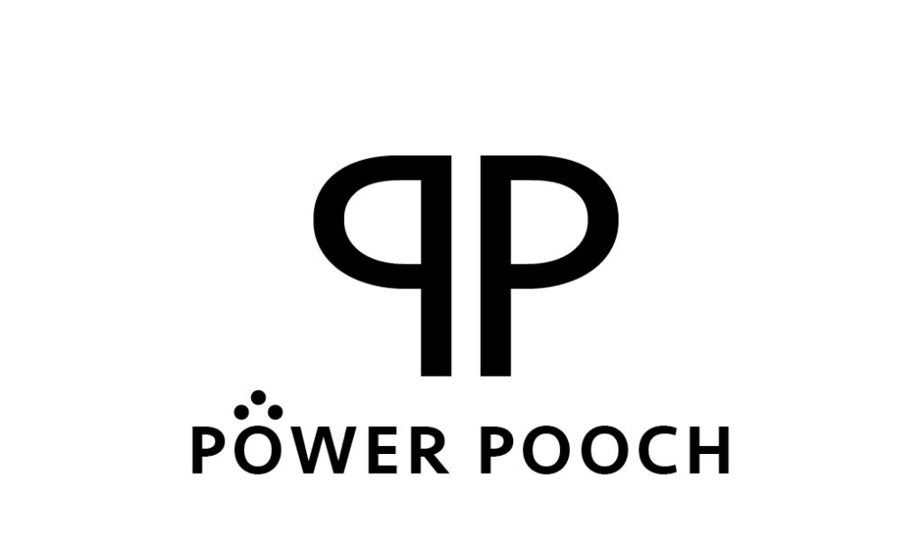
Hope you like it!