LT 2.1 – The components of visual identity
Getting to grips with the components of visual identity.
1. Name the three most important components of visual identity.
Logo, Color palette, Fonts, and Typography.
2. Describe the difference between logotype and signature.
A logotype is a company logo centered around the company name or initials like (google, coca-cola, visa).
A signature is a structured relationship between a logotype, brand mark, and tag line.
3. Use color.adobe.com or coolors.co, create a color scheme (using only three colors in each set) for the following products:
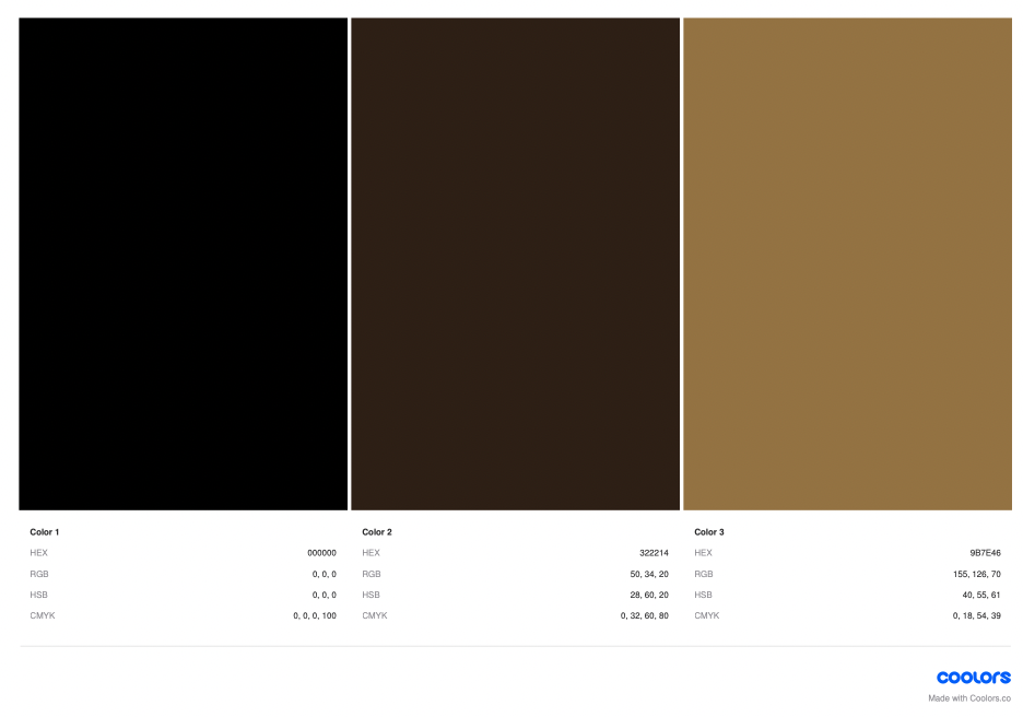
A luxury chocolate truffle brand that is made from real chocolate. The keyword here is ‘quality’.
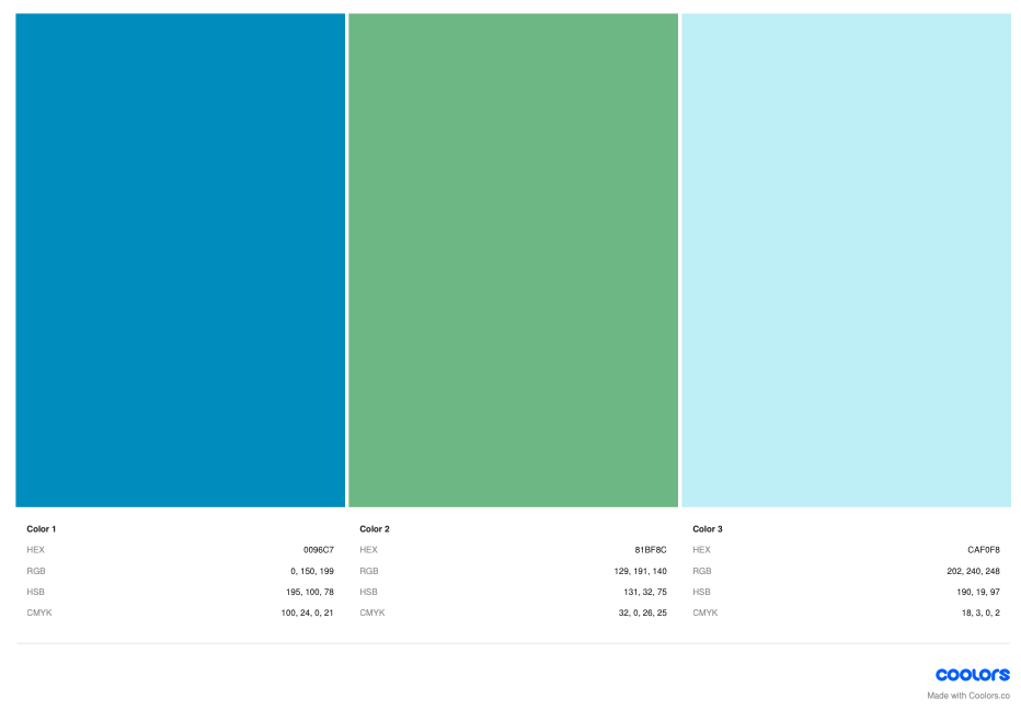
A courier company that delivers internationally by air, land, and sea – their main focus is fast delivery.
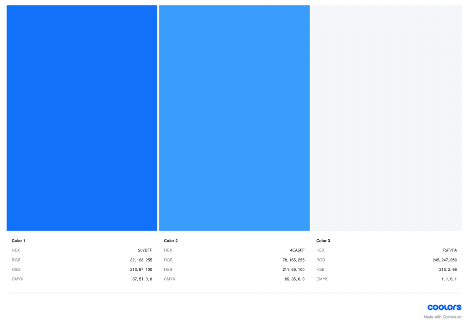
An international insurance company that focuses on family values.
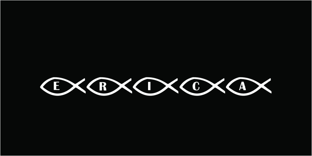
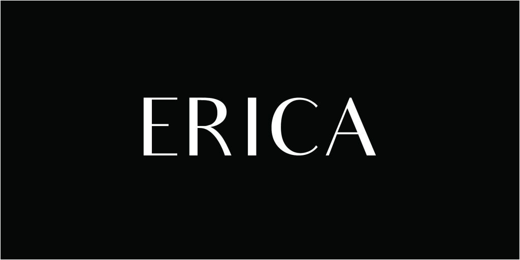
4. Write your name in four different typefaces, according to the following criteria, and write a short description of one or two sentences explaining each of your choices. Use a typeface that:
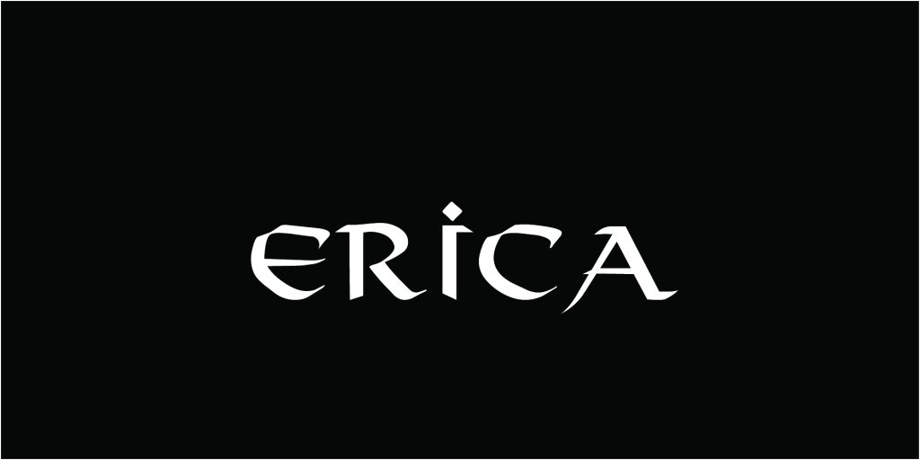
Expresses a unique quality about you. I love adventures, maybe not a unique quality, but I used to run away a lot as a kid always looking for my next adventure. I was super sad when I found out that magic and fairytales didn’t exist in the real world.

Is inspired by your favorite food. Sushi of course! So I thought this fishy typeface was perfect.
Makes your name look sophisticated. I really like the sophisticated look and feel of this typeface.
Connects you to a specific culture or ethnic group. I chose to go with a Viking typeface to represent my nordic heritage.